This is the fifth and final post in the Store Visual Planning series, designed to give you the tools to improve your retail sales environment. If you find that time or other constraints limit your ability to implement, simply call a LobbyPOP Pro for a great consult! If you have not read the prior four posts on the subject, visit the links right here for Part 1, Part 2, Part 3 and Part 4.
Now, we enter the advanced zone, the Creative Merchandising arena!
 For your particular business, one or more of the following concepts should give you inspiration to update and improve your traffic flow. After all, the more locations your patrons can visit within your retail shop, the more likely you are to make better sales! Here are the best and easiest to implement tips:
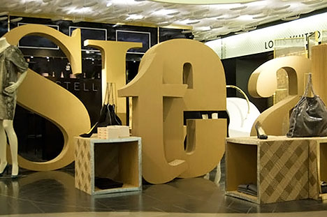
- Think of your front windows as a billboard: make it bold, colorful, and simple. DON’T put a little bit of everything in the window. Like small print, all of those little distractions are easy to overlook. Follow the rule of 10: Pick one theme, plus two colors, plus three large objects, plus four words = the “Rule of 10” (a LobbyPOP Pro concept).
- High demand products placed in the rear of the store will pull customers through the store, increasing the visibility of other products along the way. Hallmark stores often place their greeting cards at the rear of the store, moving traffic through seasonal, collectible, and other merchandise to reach the destination area.
 Consider an alternate presentation method, Lifestyle Merchandising. With this method, diverse products like apparel, books, lamps, furniture, etc., which all reflect the same theme, are displayed together in a room setting. Apply this rule to your products: How can you “show” your customer how it will look in their environment?
- Vertical or Horizontal? A tip for similar product merchandising is stacking a large shipment of a product you plan to promote on the sales floor. Picture the sorts of large displays you might see in a grocery store — pyramids of canned goods and towers of cereal, for instance. Creating an impact display by stacking a product can promote the item and solve storage problems.
- Place some impulse items next to demand items throughout your store.
- Use floor graphics, removable murals, and video signage to draw attention to particular lifestyle products, and to reduce perceived wait times at the cash counter.
If you have any questions, or want a consultation about your brand messaging within your environment, give us a call, or email: amazing@lobbypop.com
